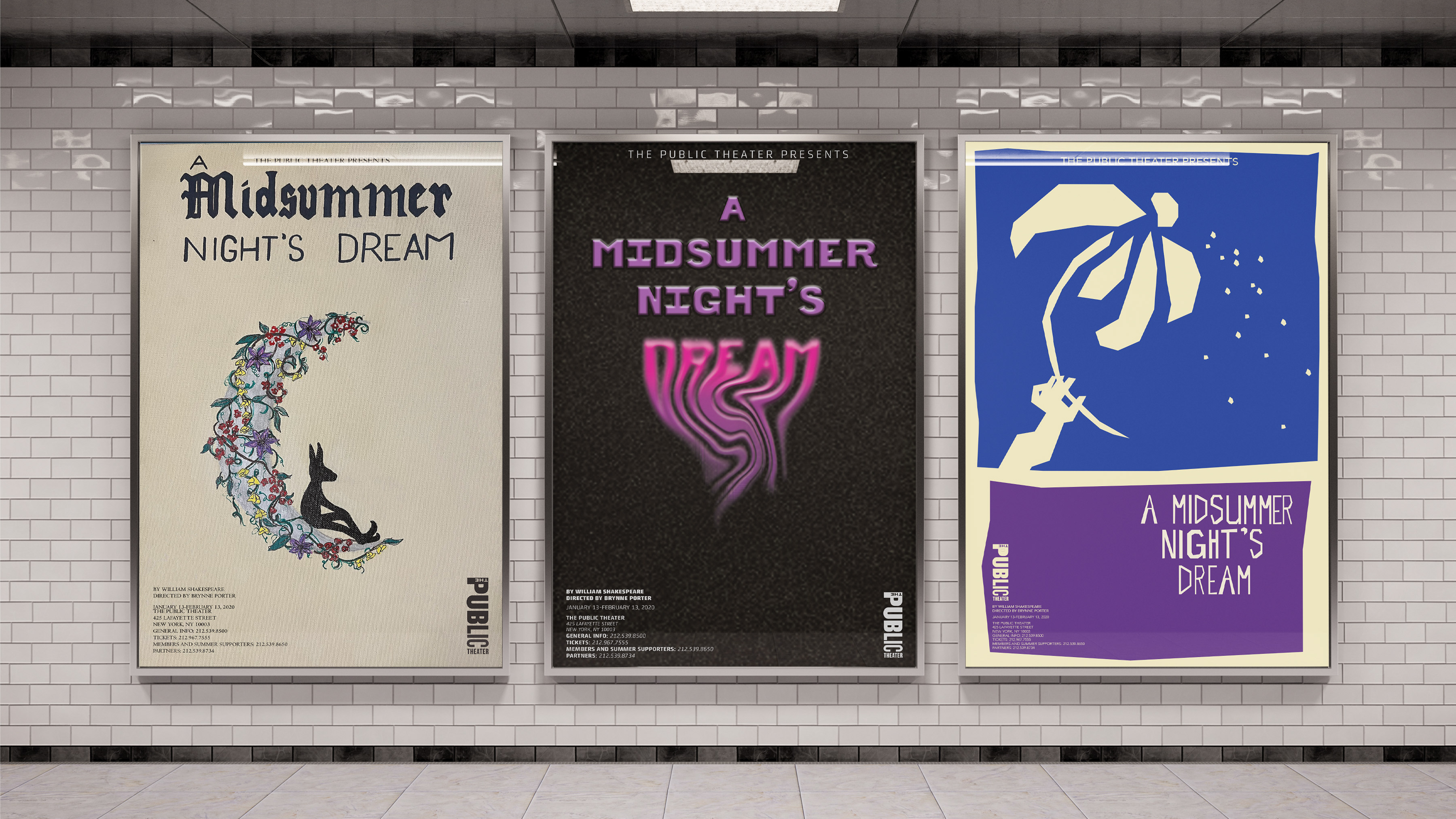
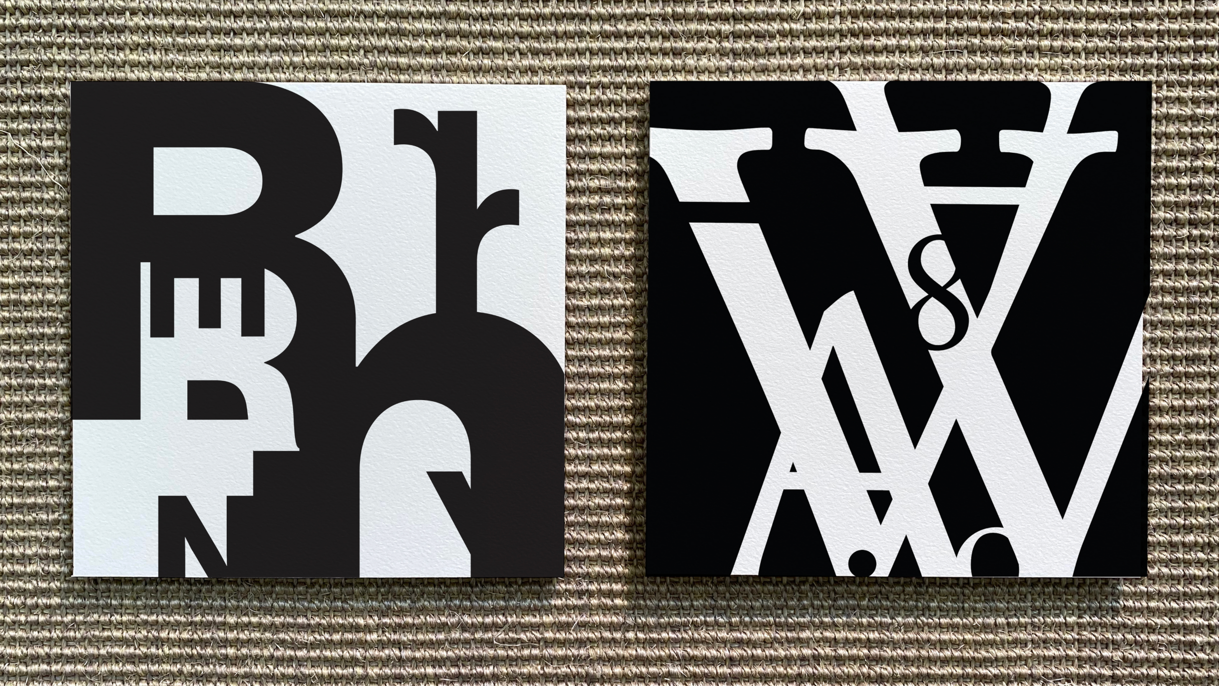
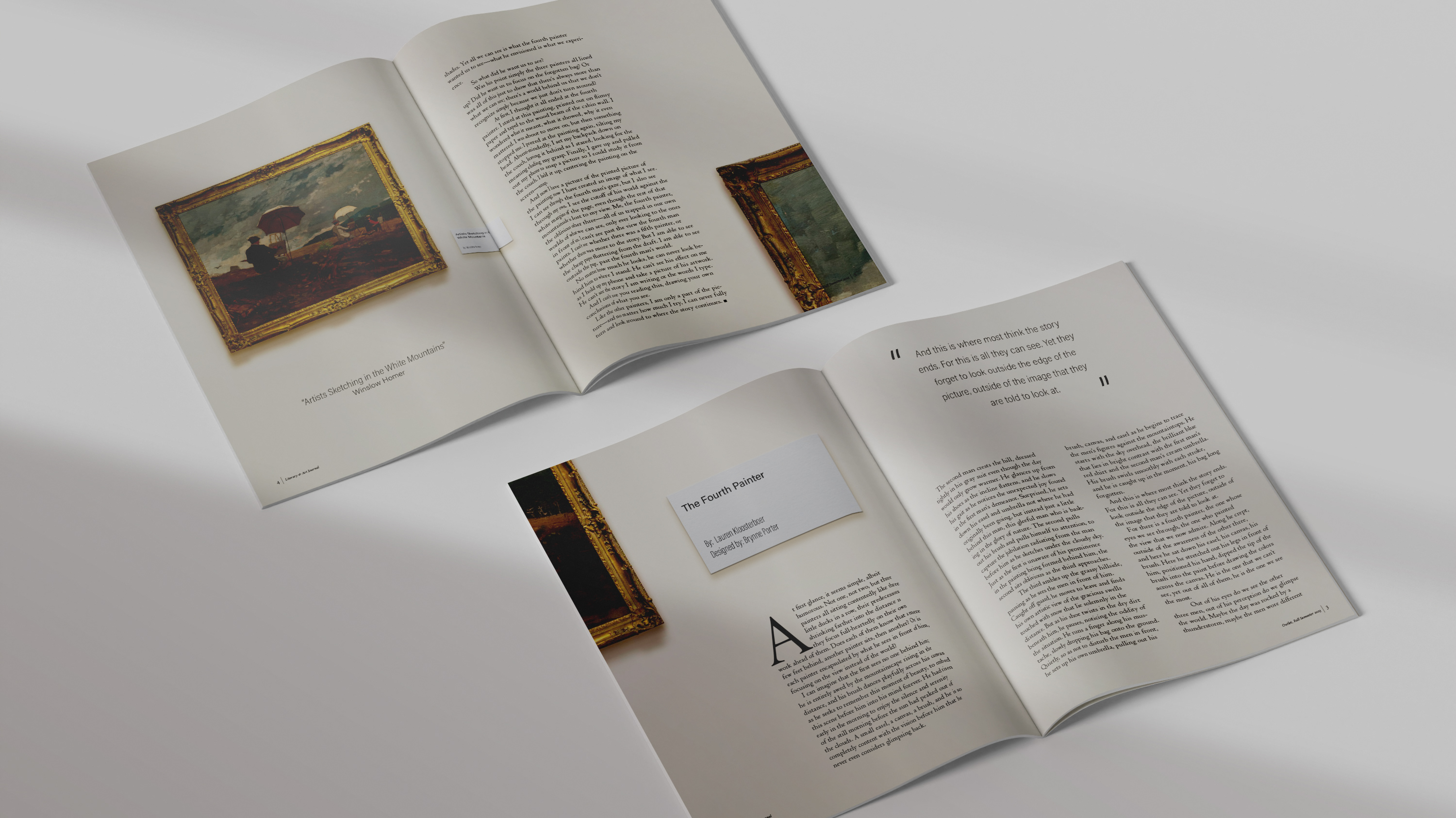
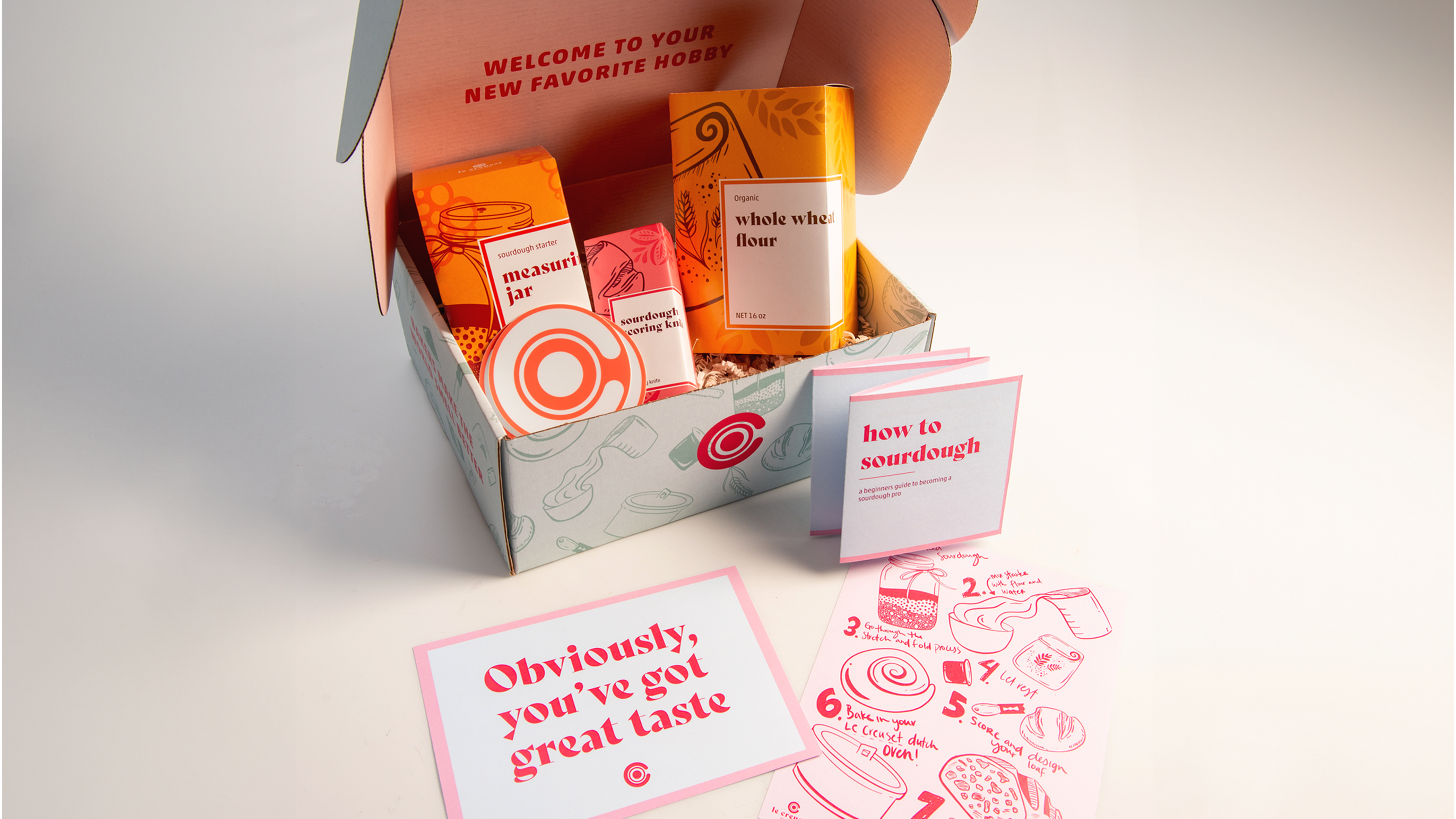
This typographical exercise explores the limitations of weight, size, and structure impact designs. I have created five different book covers, and each one has different guidelines to follow. I explored different ways to portray text in meaningful, eye catching ways. The five differing guidelines for my covers are:
1) One weight, one size
2) Two weight, one size
3) One weight, two size
4) Two weights, two sizes
5) Any weights, any sizes
1) One weight, one size
2) Two weights, one size
3) One weight, two sizes
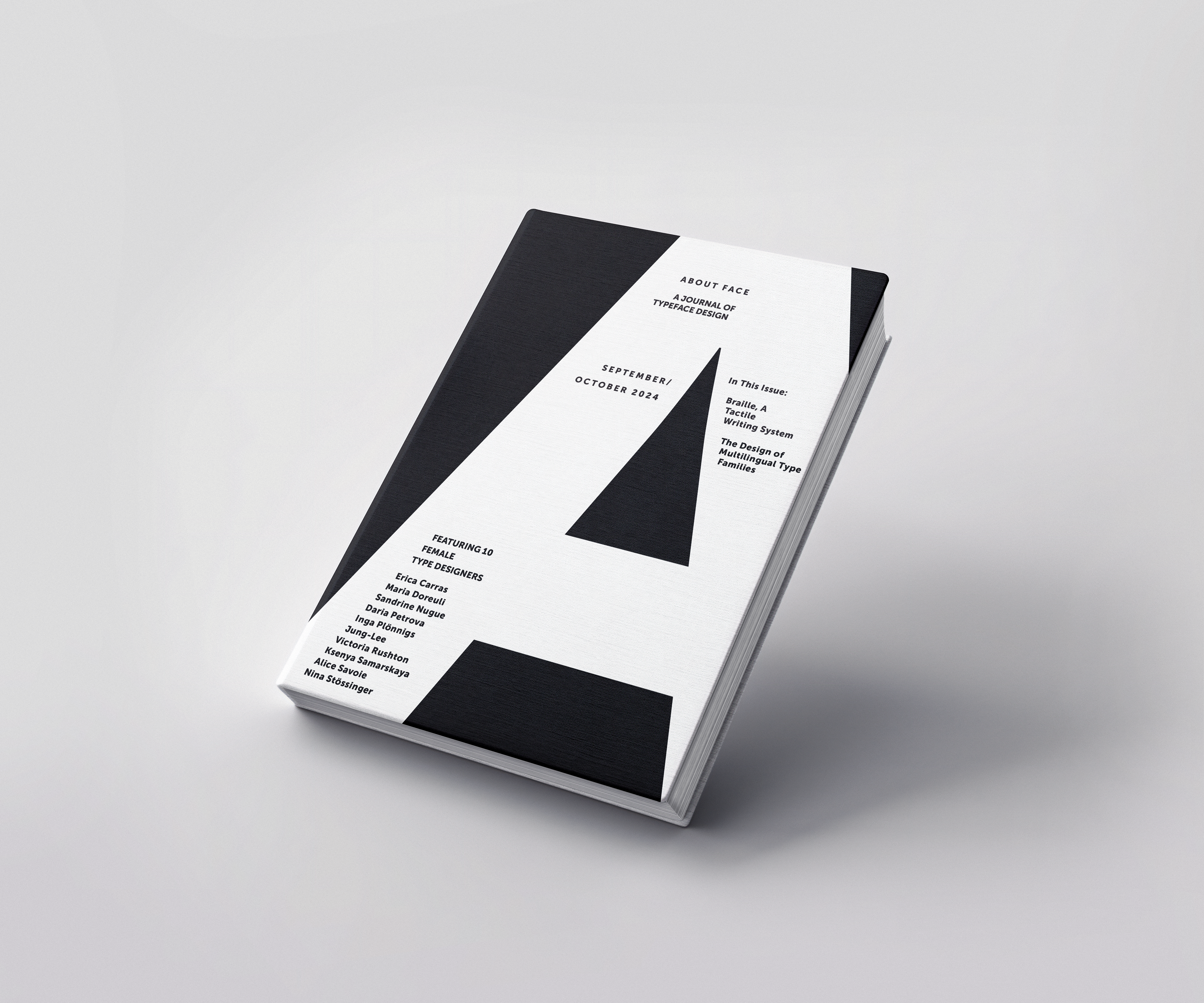
4) Two weights, two sizes
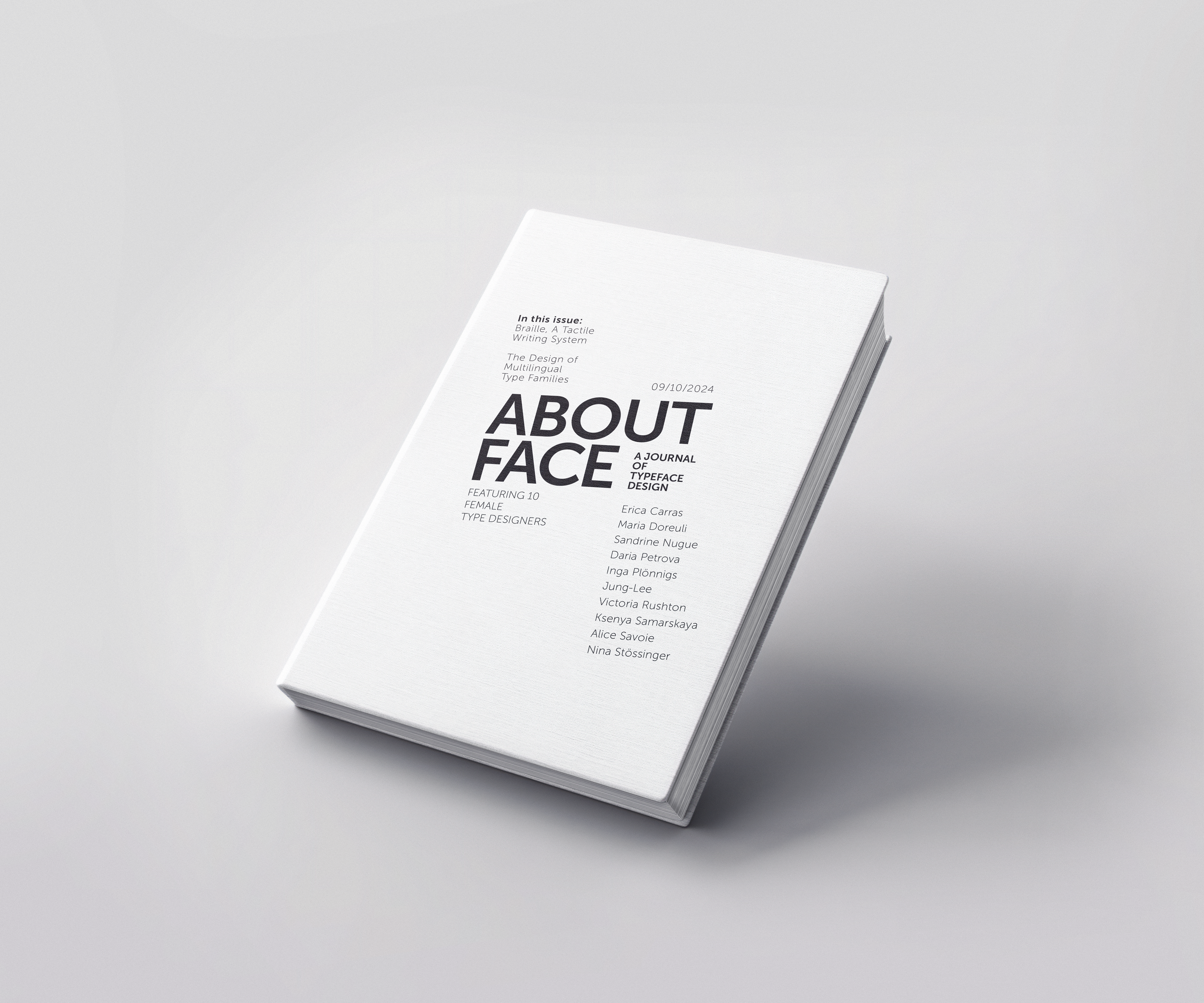
5) Any weights, any sizes

